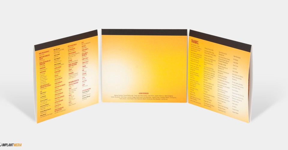
Tips for Designing Your CD Packaging
If you are in the music industry, you will understand how much the presentation of your music can influence the end consumer. Conversely, if you are a motivational speaker, your intention would be to reach out to as many people as possible.
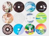
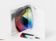
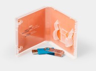
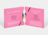
The one thing that can convince consumers to pick your product from the shelf is an attractive CD design. Here’s a checklist to consider when you are hiring a CD printing Sydney for designing your CD packaging.
Designing – The Game Changer
The design on the CD and cover must reflect your personality if you are musician or it should symbolise your company’s motto so that customers can relate to it. One tip to keep in mind is bleed the design beyond the margin line. Another tip is choose a block colour with simple text or image, so if there is variation or trimming, then the bleed ensures that the piece does not appear defective.
Content – The Reflector
Another crucial element that can make your CD and cover stick out. A CD printing Sydney service gives you options and ideas of various fonts as well as the strategic placement of the text. Your content should be crisp but convey the meaning effectively. Your text should not exceed more than 5 to 7 words or else you will have to compromise on the font size. Another benefit of small text is that you don’t have to worry about it leaking beyond the trim line or safe line.
Image – The Eye Catcher
Your artwork is about becoming the first option for consumers at the stands. You should make space for your company logo in the CD and cover. As an artist, your fans prefer your image on the CD and cover.
Now, see the image at 100% on Photoshop at a CD printing Sydney service to spot obvious errors such as pixilation or blurs. It is always better to take high resolution image and scaling it down as it will not affect the quality of the image. You have low resolution image, then try scaling it up to at least 300 dots per inch.
Another significant factor to consider is the colours used in the artwork or logo. If you are using a splashy and colourful artwork, then go to a CD printing Sydney service that allows at least three revisions of the proof before it goes for printing. When you view the artwork on the computer, the colours must look enhanced.
However, when the artwork is printed and in your hand, the colours look muted. To avoid this, design your artwork in CYMK format instead of RGB format. As a result, there is no loss of quality while your artwork goes for printing.
Holistic View
The CD printing Sydney team that you choose can convert your CD and cover into a choice rather than an option for the end user. So, choose the righting company to ensure the best result.


